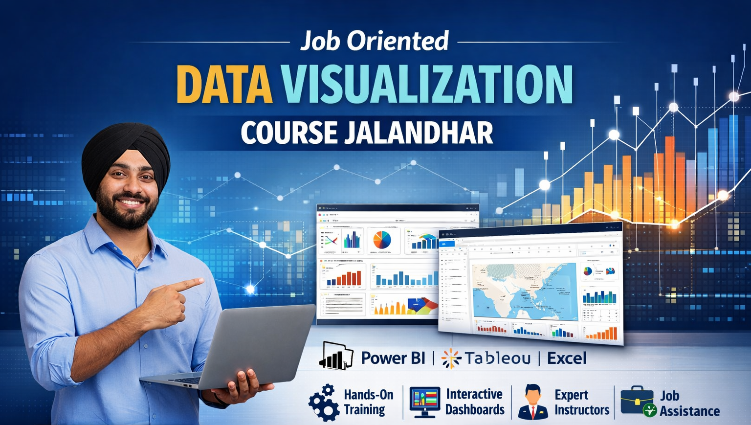
Job Oriented Data Visualization Course Jalandhar
In today’s digital economy, organizations rely heavily on data to make smarter business decisions. However, raw data alone cannot drive insights unless it is organized, analyzed, and presented in a clear visual format. This is where data visualization becomes essential. The Job Oriented Data Visualization Course Jalandhar by Techcadd is designed to help students and professionals transform complex datasets into meaningful visual stories that businesses can easily understand and act upon.
Why Data Visualization Skills Are in High Demand
Companies across industries—from retail and healthcare to finance and digital marketing—generate enormous amounts of data every day. Decision-makers need quick insights rather than lengthy spreadsheets or complicated statistical reports. Data visualization tools help convert raw numbers into dashboards, charts, and interactive reports that highlight trends, patterns, and performance metrics.
Professionals who understand how to present data effectively are highly valued because they bridge the gap between data analysis and business strategy. By learning visualization tools and techniques, students can build skills that are directly applicable in roles such as:
The Job Oriented Data Visualization Course Jalandhar offered by Techcadd focuses on building these practical skills so learners can confidently work with real-world business data.
What Makes This Course Job Oriented
Unlike traditional academic courses that focus mostly on theory, this program is structured around hands-on learning and practical implementation. The goal is to ensure that students are able to create professional dashboards and analytical reports that employers actually expect from data professionals.
Key job-oriented features include:
-
Hands-on training with industry tools such as Power BI, Tableau, and Excel dashboards
-
Real-world datasets and projects to simulate business scenarios
-
Dashboard design and storytelling techniques used by data analysts
-
Data interpretation and presentation skills for decision-making
-
Portfolio development with multiple visualization projects
By the end of the course, students will have a collection of dashboards and reports that can be showcased during job interviews or included in professional portfolios.
Who Should Join This Course
The Job Oriented Data Visualization Course Jalandhar is designed for a wide range of learners. The program starts with fundamentals, making it suitable even for beginners who have little or no prior experience with data analytics.
This course is ideal for:
-
12th pass students who want to enter the data analytics field early
-
College students and graduates looking to build employable technical skills
-
Job seekers who want to transition into data-driven careers
-
Working professionals aiming to upgrade their analytical skills
-
Marketing and finance professionals who need better reporting tools
Because the training focuses on practical implementation rather than complex mathematics, students from non-technical backgrounds can also comfortably learn and apply the concepts.
Core Learning Approach
One of the biggest strengths of the Job Oriented Data Visualization Course Jalandhar at Techcadd is its structured learning approach. The course gradually moves from basic concepts to advanced visualization techniques.
The training process typically follows these stages:
-
Understanding Data Fundamentals
Students begin by learning how data is structured, cleaned, and prepared for analysis. This foundation ensures learners understand how datasets work before creating visualizations.
-
Exploring Visualization Principles
Students learn how to select the right type of chart or visual depending on the data being analyzed. This includes bar charts, line graphs, heat maps, pie charts, and interactive dashboards.
-
Hands-on Tool Training
Industry tools such as Power BI, Tableau, and advanced Excel are introduced, allowing students to build real dashboards step by step.
-
Dashboard Design & Data Storytelling
Learners develop the ability to communicate insights clearly by designing dashboards that highlight trends, comparisons, and key metrics.
-
Project-Based Learning
Students work on multiple real-world projects to apply their knowledge and strengthen their practical skills.
Importance of Data Visualization in Modern Careers
In the past, companies relied heavily on manual reports and spreadsheets. Today, organizations prefer interactive dashboards that instantly display performance metrics and business insights. This shift has created strong demand for professionals who can design effective data visualizations.
By completing the Job Oriented Data Visualization Course Jalandhar, students gain skills that are valuable in industries such as:
Since businesses across sectors rely on data-driven decision-making, the career opportunities for skilled visualization professionals continue to grow rapidly.
Industry Tools Covered in the Course
A major highlight of the Job Oriented Data Visualization Course Jalandhar offered by Techcadd is the strong focus on industry-standard tools used by companies worldwide. Instead of learning outdated methods, students work with tools that are currently used in business intelligence, analytics, and reporting departments.
Some of the most important tools covered during the training include:
1. Microsoft Excel for Data Visualization
Excel remains one of the most widely used tools for data analysis and reporting. In this course, students learn advanced Excel techniques that go beyond basic spreadsheets.
Key Excel skills taught include:
-
Data cleaning and formatting
-
Pivot tables and pivot charts
-
Advanced formulas for analysis
-
Conditional formatting for visual insights
-
Creating professional dashboards in Excel
By mastering Excel dashboards, students gain the ability to analyze business data quickly and present insights effectively.
2. Power BI – Business Intelligence Tool
Power BI is one of the fastest-growing business intelligence tools used by organizations to create interactive dashboards and data reports.
In the Job Oriented Data Visualization Course Jalandhar, students learn how to:
-
Import and transform datasets
-
Create data models
-
Design interactive dashboards
-
Build dynamic reports with filters and slicers
-
Publish reports for team collaboration
Power BI skills are highly valued in roles related to data analytics and business intelligence, making it a crucial part of the training.
3. Tableau for Advanced Visualization
Tableau is another leading visualization platform known for its powerful analytics and interactive dashboard capabilities. Many multinational companies and analytics teams rely on Tableau to explore data and present insights visually.
Students will learn:
-
Tableau interface and data connections
-
Building visual dashboards
-
Using filters, parameters, and calculated fields
-
Storytelling with dashboards
-
Creating interactive reports for decision-making
Learning Tableau gives students a competitive advantage when applying for analytics roles.
Data Storytelling – Turning Numbers into Insights
Data visualization is not just about charts and graphs. The real value lies in the ability to tell a story using data. Decision-makers want clear answers to questions like:
-
What trends are emerging in the data?
-
Which departments are performing well?
-
Where are the opportunities for improvement?
The Job Oriented Data Visualization Course Jalandhar at Techcadd teaches students how to design dashboards that highlight the most important insights.
Key storytelling concepts include:
-
Choosing the right visualization type
-
Highlighting key performance indicators (KPIs)
-
Designing dashboards for clarity and usability
-
Structuring reports for business presentations
-
Using visual hierarchy to guide attention
These skills help students present insights confidently during meetings, reports, and presentations.
Hands-On Projects for Real-World Experience
One of the biggest challenges students face when entering the job market is the lack of practical experience. To solve this problem, the Job Oriented Data Visualization Course Jalandhar includes multiple project-based learning modules.
During the training, students work on datasets that simulate real business scenarios such as:
-
Sales performance dashboards
-
Marketing campaign analytics reports
-
Financial data visualization
-
Customer behavior analysis dashboards
-
Business performance tracking dashboards
Each project allows students to apply visualization techniques and build professional dashboards that demonstrate their capabilities.
Building a Professional Portfolio
Employers often evaluate candidates based on their project work rather than theoretical knowledge alone. For this reason, Techcadd encourages students to develop a portfolio showcasing their dashboards and visualization projects.
By the end of the Job Oriented Data Visualization Course Jalandhar, students typically have several completed projects that can be used to demonstrate their skills during interviews.
A strong portfolio may include:
-
Interactive Power BI dashboards
-
Tableau analytics reports
-
Excel-based business dashboards
-
Data storytelling presentations
-
Case study visualizations
Having a well-structured portfolio significantly increases the chances of securing interviews for data-related roles.
Learning Environment at Techcadd Jalandhar
A supportive learning environment plays a critical role in helping students understand complex concepts effectively. The Job Oriented Data Visualization Course Jalandhar at Techcadd emphasizes interactive sessions, hands-on exercises, and practical demonstrations.
Students benefit from:
-
Trainer-led practical demonstrations
-
Guided dashboard development sessions
-
Doubt-solving and concept clarification
-
Step-by-step assignments and exercises
-
Real-time feedback on project work
This structured approach helps learners build confidence while working with data visualization tools.
In addition, the training focuses on problem-solving and analytical thinking, which are essential skills for careers in data analytics and business intelligence.
Step-by-Step Learning Structure
The Job Oriented Data Visualization Course Jalandhar offered by Techcadd follows a structured learning path that ensures students build strong skills gradually. Instead of overwhelming learners with complex dashboards immediately, the course begins with fundamental concepts and slowly moves toward advanced visualization techniques.
This progressive learning approach helps students understand not only how to create dashboards but also why certain visualization choices are more effective than others.
The course generally follows this structured process:
-
Introduction to Data and Analytics Basics
Students start by understanding what data analytics and visualization mean in real-world business environments. Topics include data types, datasets, and the role of visualization in decision-making.
-
Data Preparation and Cleaning
Before creating visualizations, data must be cleaned and organized. Students learn how to handle missing values, remove duplicate entries, format datasets, and prepare them for analysis.
-
Understanding Visualization Types
Different types of charts serve different purposes. Students learn when to use bar charts, line charts, scatter plots, pie charts, and heat maps depending on the nature of the data.
-
Working with Visualization Tools
After learning the basics, students start working with industry tools such as Excel, Power BI, and Tableau to build visual reports.
-
Creating Interactive Dashboards
Students develop dashboards that allow users to interact with data through filters, slicers, and dynamic visuals.
-
Presenting Data Insights
Finally, learners focus on presenting data insights clearly so decision-makers can easily understand the information.
This step-by-step structure ensures students gain both technical skills and analytical thinking abilities required in data-focused careers.
Understanding Business Use Cases
Data visualization becomes truly valuable when it solves real business problems. The Job Oriented Data Visualization Course Jalandhar emphasizes real-world use cases so students understand how data dashboards are used in actual organizations.
Some common business scenarios explored in the course include:
-
Sales analytics dashboards that track revenue performance across regions or products
-
Marketing analytics reports showing campaign performance and customer engagement
-
Financial dashboards for monitoring expenses and profitability
-
Customer insights dashboards that analyze purchasing patterns and behavior
-
Operational performance reports that help businesses monitor productivity
By working on these examples, students learn how visualization tools support strategic decision-making in organizations.
Importance of Data Interpretation Skills
Creating charts alone does not make someone a good data professional. The ability to interpret the meaning behind the data is what makes visualization truly powerful.
In the Job Oriented Data Visualization Course Jalandhar, students learn how to analyze dashboards and identify meaningful insights. For example, they learn to answer questions such as:
-
What trends are visible in the dataset?
-
Are there unusual patterns or anomalies?
-
Which products or services perform best?
-
What factors might influence business performance?
Learning how to interpret data helps students move beyond basic reporting and develop skills required for analytical roles.
Career Preparation and Industry Readiness
A major focus of the Job Oriented Data Visualization Course Jalandhar is preparing students for real job opportunities. Many companies look for candidates who can combine technical tool knowledge with the ability to communicate insights clearly.
The training emphasizes the development of the following professional skills:
Students also learn how visualization professionals collaborate with different departments such as marketing, finance, and operations. Understanding these cross-functional requirements helps learners adapt quickly in professional environments.
Advantages of Learning Data Visualization Today
Data visualization has become one of the most valuable skills in the analytics ecosystem. As companies collect more data than ever before, the need for professionals who can simplify and present information visually continues to increase.
Some major advantages of learning data visualization include:
-
Strong demand across multiple industries
-
Opportunities in both technical and non-technical roles
-
Ability to work with business intelligence tools
-
Potential to move into advanced analytics careers
-
Valuable skill for freelance and consulting projects
Students who complete the Job Oriented Data Visualization Course Jalandhar gain skills that can open doors to careers in analytics, reporting, and business intelligence.
With organizations increasingly adopting data-driven strategies, professionals who can design clear and impactful dashboards will remain highly valuable in the job market.
Practical Training with Real Business Data
A key feature of the Job Oriented Data Visualization Course Jalandhar at Techcadd is the strong emphasis on practical learning. Instead of relying solely on theoretical explanations, the course allows students to work with real-world datasets that reflect how businesses operate.
During the training, students learn how to handle different types of data such as sales reports, customer data, marketing performance metrics, and financial records. Working with these datasets helps learners understand how companies actually use dashboards and reports to monitor performance and make informed decisions.
Students practice tasks such as:
-
Importing and organizing datasets
-
Cleaning and structuring raw data
-
Creating charts and visual reports
-
Designing interactive dashboards
-
Identifying trends and patterns in data
By regularly working with practical exercises, learners gain confidence in using visualization tools and understanding business data.
Understanding Dashboard Design Best Practices
One of the most important aspects of data visualization is designing dashboards that are easy to understand. A poorly designed dashboard can confuse decision-makers instead of helping them.
In the Job Oriented Data Visualization Course Jalandhar, students learn key dashboard design principles such as:
-
Keeping layouts simple and organized
-
Highlighting key performance indicators (KPIs)
-
Using appropriate colors and chart types
-
Maintaining visual consistency
-
Ensuring dashboards are easy to interpret
These design principles ensure that dashboards communicate information clearly and efficiently. Students also learn how to structure dashboards in a way that allows managers and stakeholders to quickly understand the insights being presented.
Developing Analytical Thinking
Beyond tool usage, the course focuses on building analytical thinking skills. Data professionals are expected not only to create charts but also to understand what the data reveals.
Students are encouraged to ask questions such as:
-
What does this data indicate about business performance?
-
Are there patterns or seasonal trends in the dataset?
-
What recommendations can be made based on the data?
By practicing these analytical approaches, students develop the ability to convert raw information into meaningful insights that support decision-making.
Preparing Students for Data-Driven Careers
The Job Oriented Data Visualization Course Jalandhar aims to prepare students for roles that require strong reporting and visualization skills. Since companies across industries rely on data dashboards, professionals with these capabilities can find opportunities in many sectors.
Possible career paths after completing the training include:
These roles often involve analyzing datasets, building dashboards, and communicating insights to management teams.
Skills Students Gain from the Course
By the end of the Job Oriented Data Visualization Course Jalandhar, students typically develop a well-rounded set of skills that combine technical expertise with analytical understanding.
Key skills gained include:
-
Data cleaning and preparation techniques
-
Visualization design principles
-
Dashboard creation using Excel, Power BI, and Tableau
-
Data storytelling and presentation skills
-
Analytical thinking and interpretation of trends
-
Ability to build professional data reports
These capabilities help students confidently apply for entry-level analytics roles or integrate data visualization into their existing job responsibilities.
Why Learning Data Visualization is a Smart Career Move
Data-driven decision-making has become a central part of modern business operations. Organizations rely on dashboards and reports to monitor performance, identify opportunities, and track growth.
Because of this shift, professionals who can visualize and interpret data have become extremely valuable. The Job Oriented Data Visualization Course Jalandhar at Techcadd equips learners with the skills needed to participate in this rapidly growing field.
For students in Jalandhar who want to explore careers in analytics, reporting, or business intelligence, learning data visualization provides a practical pathway into the data industry.
With the right combination of tools, project experience, and analytical skills, learners can build a strong foundation for future career opportunities in data-focused roles.
Why Techcadd for Job Oriented Data Visualization Course Jalandhar
Choosing the right training institute can significantly impact how effectively students learn and how well they prepare for real job opportunities. When it comes to building practical data skills, learners need more than just theoretical lectures—they need structured training, industry-relevant tools, and guidance that aligns with current market requirements. This is where Techcadd stands out as a reliable training institute for students looking to enroll in a Job Oriented Data Visualization Course Jalandhar.
Industry-Focused Training Approach
One of the biggest reasons students choose Techcadd is its industry-focused training model. Many traditional courses focus primarily on theoretical concepts without explaining how those concepts are applied in real business environments. However, the Job Oriented Data Visualization Course Jalandhar at Techcadd is designed to bridge this gap by emphasizing practical implementation.
Students learn how businesses use data dashboards, reports, and visual analytics tools to monitor performance and make decisions. Instead of only studying definitions or formulas, learners actively work on creating dashboards, visual reports, and analytical presentations.
This hands-on approach helps students understand the practical value of data visualization skills and prepares them to apply these skills in professional settings.
Experienced Trainers with Industry Knowledge
Another important advantage of learning at Techcadd is the opportunity to learn from experienced trainers who understand the data analytics industry. Trainers guide students through the entire learning process, explaining concepts clearly and demonstrating how tools are used in real-world projects.
Experienced instructors also help students understand common challenges that occur while working with data. For example, they provide guidance on:
-
Handling messy or incomplete datasets
-
Choosing the right visualization for different types of data
-
Designing dashboards that highlight key insights
-
Avoiding common mistakes in data reporting
This mentorship helps students develop both technical proficiency and problem-solving ability, which are essential for careers in analytics and business intelligence.
Practical Learning Environment
A supportive learning environment plays an important role in helping students grasp complex topics. The Job Oriented Data Visualization Course Jalandhar at Techcadd focuses heavily on interactive learning rather than passive lectures.
Students regularly participate in:
-
Hands-on dashboard creation sessions
-
Tool demonstrations and guided exercises
-
Data interpretation activities
-
Practical assignments and mini-projects
-
Interactive discussions about real business scenarios
This learning structure encourages students to actively practice what they learn during the course. As a result, learners develop confidence in working with data visualization tools and analytical techniques.
Focus on Job-Oriented Skills
The primary goal of the Job Oriented Data Visualization Course Jalandhar is to help students develop skills that employers actually value. Instead of teaching outdated or irrelevant topics, the training focuses on tools and techniques used in modern analytics teams.
Students gain experience in areas such as:
-
Creating interactive dashboards
-
Building professional business reports
-
Presenting insights through data storytelling
-
Understanding key business performance indicators
These job-oriented skills make it easier for students to transition from learning environments to professional roles.
Strong Learning Foundation for Data Careers
Data visualization is often the starting point for many careers in the data analytics ecosystem. By learning how to organize and present data effectively, students develop a foundation that can lead to more advanced roles in analytics, business intelligence, or data science.
Through the Job Oriented Data Visualization Course Jalandhar, Techcadd helps students build this foundation step by step. The focus on real-world tools, practical assignments, and analytical thinking ensures learners are well prepared to pursue opportunities in the growing field of data analytics.
Project-Based Learning That Builds Real Skills
One of the biggest problems students face when entering the job market is the lack of practical experience. Many learners complete courses but struggle to demonstrate their skills during interviews because they have never worked on real datasets or built actual dashboards.
The Job Oriented Data Visualization Course Jalandhar at Techcadd solves this problem through a strong focus on project-based learning. Students do not just learn tools—they actively apply them to create real dashboards and analytical reports.
During the training, students work on projects such as:
-
Sales performance dashboards
-
Marketing campaign analytics reports
-
Financial performance visualizations
-
Customer behavior dashboards
-
Business KPI tracking reports
Each project simulates real business scenarios so that students understand how data visualization tools are used in professional environments.
By the end of the course, learners typically have several completed dashboards and visual reports that can be included in their professional portfolio.
Portfolio Development for Career Growth
A strong portfolio can make a major difference when applying for analytics roles. Employers often prefer candidates who can demonstrate practical work rather than just theoretical knowledge.
At Techcadd, students are encouraged to develop a portfolio of visualization projects throughout the Job Oriented Data Visualization Course Jalandhar. Trainers guide students in creating dashboards that showcase their analytical thinking and technical abilities.
A well-developed portfolio may include:
-
Interactive Power BI dashboards
-
Tableau visual analytics reports
-
Excel-based business dashboards
-
Data storytelling presentations
-
Case study visualizations using real datasets
Having a portfolio allows students to clearly demonstrate their skills during job interviews. It also shows employers that the candidate has hands-on experience working with data visualization tools.
Supportive Learning for Beginners
Many students hesitate to enter the analytics field because they believe it requires advanced programming or complex mathematical knowledge. However, the Job Oriented Data Visualization Course Jalandhar at Techcadd is designed to be beginner-friendly.
The training starts with basic concepts and gradually introduces more advanced visualization techniques. This structured approach helps students from non-technical backgrounds learn comfortably.
Students receive support through:
-
Step-by-step tool demonstrations
-
Concept explanations using real examples
-
Guided assignments for practice
-
Doubt-solving sessions with trainers
Because of this supportive learning environment, students from different educational backgrounds—including commerce, arts, and science streams—can successfully learn data visualization.
Local Training Advantage for Jalandhar Students
For students in Jalandhar, choosing a local training institute offers several advantages. Attending classes at Techcadd allows learners to interact directly with trainers, collaborate with peers, and receive immediate feedback on their work.
Local classroom learning also provides opportunities for:
-
Peer discussions and collaborative learning
-
Networking with other aspiring data professionals
-
Personalized guidance from trainers
-
Immediate help when facing technical challenges
These benefits often make the learning experience more engaging and productive compared to purely self-paced online learning.
Skill Development Beyond Tools
While tools like Power BI and Tableau are important, employers also look for professionals who can communicate insights clearly and think analytically. The Job Oriented Data Visualization Course Jalandhar at Techcadd focuses on developing these broader professional skills as well.
Students are trained to:
-
Interpret trends in datasets
-
Identify meaningful insights from visualizations
-
Present findings in a structured and clear manner
-
Explain data-driven conclusions to stakeholders
These capabilities help learners move beyond basic dashboard creation and develop the skills required for roles in analytics, reporting, and business intelligence.
By combining practical tool training, project work, portfolio development, and analytical thinking, Techcadd provides students with a well-rounded learning experience that supports their journey into the world of data-driven careers.
Structured Curriculum Designed for Industry Needs
Another major reason students choose Techcadd for the Job Oriented Data Visualization Course Jalandhar is the well-structured curriculum that aligns with industry requirements. Instead of focusing on outdated techniques, the course is regularly updated to match the tools and practices currently used by businesses.
The training curriculum is designed to ensure that students learn the most relevant skills needed in data analytics and business intelligence roles. The learning journey moves from fundamental concepts to advanced dashboard development, ensuring that students develop both technical expertise and analytical thinking abilities.
The structured curriculum generally includes:
-
Data fundamentals and dataset understanding
-
Data cleaning and preparation techniques
-
Visualization principles and chart selection
-
Dashboard creation using Excel, Power BI, and Tableau
-
Data storytelling and presentation techniques
-
Real-world business dashboard projects
This structured approach helps students build confidence while learning and ensures that each topic supports the next stage of skill development.
Hands-On Tool Mastery
One of the most valuable aspects of the Job Oriented Data Visualization Course Jalandhar at Techcadd is the opportunity to gain hands-on experience with industry-standard tools. Visualization tools such as Power BI and Tableau are widely used by companies for reporting and analytics.
Instead of simply watching demonstrations, students actively work with these tools to create dashboards and reports. This practical exposure helps learners become comfortable with real analytics workflows.
Students learn how to:
-
Connect visualization tools with datasets
-
Transform and organize raw data
-
Build interactive dashboards
-
Create visual reports with filters and dynamic elements
-
Publish dashboards for presentation and collaboration
By practicing these skills repeatedly, students gain confidence in working with data visualization platforms.
Guidance for Building Job-Ready Skills
A key goal of the Job Oriented Data Visualization Course Jalandhar is to help students develop skills that align with real job responsibilities. Data professionals are often expected to present insights clearly and support decision-making processes within organizations.
At Techcadd, trainers guide students on how to approach business problems using data visualization. Learners are encouraged to think about questions such as:
-
What insights can be extracted from this dataset?
-
Which visualization best communicates the message?
-
How should the dashboard be structured for business users?
This problem-solving approach helps students develop the mindset required for careers in analytics.
Continuous Practice and Assignments
Practice plays a crucial role in mastering data visualization tools. The Job Oriented Data Visualization Course Jalandhar includes multiple assignments and exercises that allow students to apply their learning regularly.
Assignments may involve tasks such as:
-
Creating dashboards from raw datasets
-
Designing visual reports for specific business scenarios
-
Comparing multiple visualization methods for the same dataset
-
Identifying patterns and insights from dashboards
These assignments help reinforce concepts and allow students to gradually improve their dashboard-building skills.
Building Confidence for Professional Roles
Many students feel unsure about entering technical careers due to a lack of experience. The supportive training approach at Techcadd helps learners gradually build confidence in their abilities.
By the time students complete the Job Oriented Data Visualization Course Jalandhar, they typically feel comfortable working with visualization tools and interpreting datasets.
This confidence is essential when attending job interviews or presenting dashboards to employers. Students who can clearly explain their projects and insights often stand out in the hiring process.
Through a combination of structured learning, hands-on training, practical assignments, and expert guidance, Techcadd helps students build a strong foundation for careers in data visualization and analytics.
Career-Focused Learning Approach
One of the strongest reasons students choose Techcadd for the Job Oriented Data Visualization Course Jalandhar is its clear focus on career readiness. The course is designed not only to teach technical tools but also to prepare students for real job roles in analytics and reporting.
Many training programs stop at teaching software features, but Techcadd focuses on helping students understand how these tools are used in professional environments. Learners develop the ability to analyze business data, identify insights, and present those insights through clear visual dashboards.
This career-focused training ensures that students are not just learning software but are also developing skills required for roles such as:
By combining visualization skills with analytical thinking, students become more attractive candidates for employers looking for data-driven professionals.
Real Business Scenarios and Case Studies
Understanding real-world applications is essential for mastering data visualization. The Job Oriented Data Visualization Course Jalandhar at Techcadd incorporates business case studies that show how companies use dashboards to track performance and make strategic decisions.
Students analyze datasets related to areas such as:
-
Sales performance analysis
-
Marketing campaign effectiveness
-
Customer behavior insights
-
Financial reporting dashboards
-
Operational performance tracking
Working on these scenarios helps students understand how visualization tools are used across different industries. It also gives them experience working with datasets similar to those used in real organizations.
Collaborative Learning and Peer Interaction
Learning alongside other motivated students creates a productive environment that encourages collaboration and knowledge sharing. The classroom environment at Techcadd allows students to interact with peers who share similar career interests.
Through group discussions and collaborative activities, students can:
-
Exchange ideas about dashboard design
-
Discuss different approaches to analyzing datasets
-
Learn from the experiences of other students
-
Improve their problem-solving skills through teamwork
This collaborative learning atmosphere helps learners develop communication skills that are valuable in professional workplaces.
Skill Development That Goes Beyond the Classroom
While technical tools are essential, successful data professionals also need strong communication and analytical skills. The Job Oriented Data Visualization Course Jalandhar at Techcadd encourages students to develop these broader capabilities.
Students learn how to:
-
Present insights clearly through dashboards
-
Explain analytical findings to non-technical audiences
-
Organize reports for business stakeholders
-
Translate complex data into simple visual messages
These skills help students become effective communicators who can support decision-making within organizations.
A Reliable Training Institute for Data Skills
For students in Jalandhar looking to enter the analytics field, choosing the right training institute is an important step. Techcadd focuses on practical learning, industry-relevant tools, and structured guidance that helps students build real skills.
The Job Oriented Data Visualization Course Jalandhar provides learners with the opportunity to explore the world of data analytics while developing hands-on experience with modern visualization tools.
By combining structured training, practical projects, portfolio development, and career-focused learning, Techcadd helps students build a strong foundation for entering the growing field of data visualization and business intelligence.
Future Scope After Completing Job Oriented Data Visualization Course Jalandhar
The demand for data professionals has increased significantly over the past decade as businesses across industries rely heavily on data to guide decision-making. Organizations collect massive volumes of data every day, but raw data alone does not provide value unless it is properly analyzed and presented in a meaningful format. This is where data visualization plays a crucial role.
Students who complete the Job Oriented Data Visualization Course Jalandhar at Techcadd gain skills that are increasingly valuable in today’s job market. By learning how to convert complex datasets into clear visual dashboards, students become capable of supporting data-driven decision-making processes in organizations.
Growing Importance of Data Visualization in Modern Businesses
Companies today operate in highly competitive markets where quick and accurate decisions can determine success. Business leaders need to understand performance metrics, customer trends, financial data, and operational insights quickly. Instead of reviewing large spreadsheets, they rely on dashboards and visual reports that summarize key information.
Data visualization tools help organizations:
-
Identify trends and patterns in data
-
Monitor business performance in real time
-
Track key performance indicators (KPIs)
-
Compare results across departments or regions
-
Support strategic decision-making
Because of these advantages, companies across sectors are investing heavily in business intelligence and analytics systems. As a result, professionals who can build and interpret dashboards are becoming essential members of analytics teams.
Wide Range of Career Opportunities
Completing the Job Oriented Data Visualization Course Jalandhar opens doors to several career opportunities in data analytics and reporting roles. These roles exist in almost every industry, making data visualization skills highly versatile.
Some common career paths include:
1. Data Analyst
Data analysts work with datasets to identify trends, patterns, and insights that help businesses improve performance. Visualization tools are a major part of their workflow because they help present analytical results in an understandable format.
Responsibilities may include:
-
Analyzing datasets to identify trends
-
Creating dashboards and reports
-
Communicating insights to management
-
Supporting business decision-making
2. Business Intelligence Analyst
Business intelligence professionals focus on building dashboards and analytical systems that track company performance. They often use tools like Power BI and Tableau to create visual reports that help executives monitor key metrics.
Responsibilities may include:
-
Designing business dashboards
-
Monitoring performance indicators
-
Building automated reporting systems
-
Supporting strategic planning with data insights
3. Reporting Analyst
Reporting analysts specialize in preparing structured reports that summarize business data. Visualization tools allow them to create visual summaries that make complex information easier to understand.
These professionals typically work with departments such as marketing, finance, or operations to produce performance reports.
Demand Across Multiple Industries
One of the major advantages of data visualization skills is that they are useful in many industries. Almost every organization that collects and analyzes data needs professionals who can present insights clearly.
Industries that frequently hire data visualization professionals include:
-
Information technology and software companies
-
Digital marketing agencies
-
E-commerce platforms
-
Financial institutions
-
Healthcare analytics firms
-
Consulting organizations
Because data is central to modern business operations, professionals who can visualize and interpret data remain in high demand.
Foundation for Advanced Data Careers
Learning visualization tools is often the first step toward more advanced careers in data analytics. After completing the Job Oriented Data Visualization Course Jalandhar, students may choose to further develop their skills in areas such as:
-
Data analytics and statistical analysis
-
Business intelligence development
-
Data science and machine learning
-
Advanced data modeling
This makes data visualization an excellent starting point for students interested in long-term careers in the data field.
Increasing Demand for Business Intelligence Professionals
Over the last few years, organizations have started relying heavily on business intelligence (BI) systems to analyze performance data. BI platforms allow companies to track real-time information related to sales, customer engagement, marketing campaigns, operational efficiency, and financial performance.
Visualization tools such as Power BI and Tableau play a central role in these systems because they help transform raw business data into interactive dashboards that decision-makers can easily understand.
As more organizations adopt business intelligence technologies, the demand for professionals who can design and manage these dashboards continues to grow. Students who complete the Job Oriented Data Visualization Course Jalandhar gain the foundational skills required to work in BI teams where they may be responsible for:
-
Creating and maintaining business dashboards
-
Designing interactive reports for executives
-
Monitoring key performance indicators
-
Presenting insights to different departments
This growing reliance on visual analytics makes data visualization a highly valuable career skill.
Opportunities in Digital Marketing Analytics
Another area where data visualization skills are extremely valuable is digital marketing analytics. Marketing teams rely on data dashboards to monitor campaign performance and measure customer engagement across different platforms.
Digital marketing agencies and in-house marketing teams frequently use visualization dashboards to analyze metrics such as:
-
Website traffic and user behavior
-
Advertising campaign performance
-
Conversion rates and sales trends
-
Customer demographics and engagement levels
Professionals who understand both marketing metrics and visualization tools can help companies make better decisions about their marketing strategies.
Students who complete the Job Oriented Data Visualization Course Jalandhar may find opportunities in roles such as:
These roles combine analytical thinking with visualization techniques to help marketing teams understand performance metrics more clearly.
Growing Role in Financial and Business Reporting
Financial departments also rely heavily on data visualization to track financial performance, budgets, and operational costs. Visualization dashboards allow finance teams to quickly review key metrics without going through lengthy reports.
Financial dashboards may include information related to:
Professionals who can design these dashboards help organizations monitor financial performance more effectively.
Completing the Job Oriented Data Visualization Course Jalandhar provides students with the skills required to contribute to financial reporting systems by presenting financial data in visually understandable formats.
Freelancing and Consulting Opportunities
Another interesting career path for individuals with data visualization skills is freelancing. Many small businesses and startups require dashboards and analytics reports but may not have full-time data teams.
Freelance visualization professionals can help these organizations by:
-
Designing dashboards for business reporting
-
Creating performance analytics reports
-
Visualizing customer and sales data
-
Helping companies interpret their data insights
Freelancing opportunities can be found through various platforms and consulting networks. Skilled visualization professionals can work with clients from different industries and locations.
Building a Long-Term Career in Data
Data visualization is often considered an entry point into the broader field of data analytics and business intelligence. Professionals who start with visualization tools often expand their skills over time to include advanced analytics, programming languages, and machine learning techniques.
Students who complete the Job Oriented Data Visualization Course Jalandhar can gradually progress toward advanced career paths such as:
Because data continues to play a central role in business strategy, professionals with strong visualization and analytical skills will remain valuable in the job market for years to come.
Strong Demand in the Growing Data Economy
We are living in what many experts call the data economy. Businesses generate massive amounts of data from websites, mobile apps, customer interactions, financial transactions, and operational systems. However, raw data by itself is not useful unless it is interpreted and presented clearly.
This is why data visualization has become one of the most important skills in the analytics ecosystem. Professionals who can convert raw datasets into meaningful dashboards help organizations understand their performance and make smarter decisions.
Students who complete the Job Oriented Data Visualization Course Jalandhar gain skills that directly support this growing demand. Since almost every modern organization relies on dashboards and analytical reports, the need for professionals who can create visual insights continues to expand.
As companies invest more in analytics systems and business intelligence tools, opportunities for skilled visualization professionals will continue to increase.
Opportunities in Startups and Technology Companies
Startups and technology companies often rely heavily on data to monitor growth and measure product performance. These organizations frequently use dashboards to track metrics such as:
-
User growth and engagement
-
Product performance
-
Customer acquisition trends
-
Revenue and subscription analytics
Because startups move quickly and rely on real-time insights, they often require dashboards that can display information instantly and clearly.
Professionals who complete the Job Oriented Data Visualization Course Jalandhar can find opportunities in startup environments where they help founders and managers track important metrics using interactive dashboards.
These roles often involve:
-
Creating startup performance dashboards
-
Tracking user engagement metrics
-
Monitoring sales and growth indicators
-
Presenting insights to leadership teams
Working in startup environments can also provide valuable exposure to multiple aspects of business analytics.
Importance of Visualization in Decision-Making
Modern organizations no longer rely solely on intuition when making decisions. Instead, they depend on data-driven decision-making processes that rely heavily on visualization dashboards.
Visualization dashboards allow decision-makers to quickly identify patterns and trends that might otherwise remain hidden in large datasets.
For example, visualization dashboards can help organizations:
-
Identify declining sales trends early
-
Monitor marketing campaign effectiveness
-
Track operational performance in real time
-
Compare results across different regions or departments
Because of these advantages, visualization dashboards have become a central component of business intelligence systems.
Students who complete the Job Oriented Data Visualization Course Jalandhar develop the ability to design dashboards that help organizations interpret data effectively and make informed decisions.
Opportunities for Career Advancement
Once students gain experience working with visualization tools and analytical reports, they can gradually move into more advanced roles within the analytics field.
Career progression often follows stages such as:
-
Junior Data Analyst – focusing on dashboard creation and basic reporting
-
Data Analyst – performing deeper data analysis and generating insights
-
Business Intelligence Analyst – designing advanced dashboards and analytics systems
-
Analytics Manager or Consultant – guiding organizations on data strategy and reporting systems
With experience and additional skill development, professionals can also transition into specialized roles such as data science, advanced analytics, or predictive modeling.
Global Relevance of Data Visualization Skills
Another advantage of learning data visualization is that these skills are globally relevant. Visualization tools such as Power BI and Tableau are used by companies around the world, which means professionals trained in these tools can explore opportunities in different cities or even remote roles with international companies.
Students who complete the Job Oriented Data Visualization Course Jalandhar gain practical skills that are recognized across industries and geographic locations. This flexibility allows professionals to adapt to changing job markets and explore diverse career paths within the data analytics field.
High Demand for Visualization Skills in Corporate Environments
Modern organizations operate in highly competitive environments where decisions must be based on accurate and timely insights. Executives, managers, and analysts rely on dashboards to quickly understand business performance and identify opportunities for improvement. Visualization tools help simplify complex datasets so that important patterns and trends become easier to interpret.
Because of this shift toward data-driven management, professionals with strong visualization skills are increasingly valued in corporate environments. Companies across sectors require individuals who can design dashboards that clearly present important business metrics.
Students who complete the Job Oriented Data Visualization Course Jalandhar at Techcadd develop the ability to build dashboards that communicate insights effectively. This ability allows them to contribute to various departments within an organization, including marketing, finance, operations, and product management.
Expanding Opportunities in Data Analytics Teams
Many organizations now maintain dedicated data analytics teams responsible for collecting, analyzing, and interpreting data. Visualization specialists often work alongside data analysts, data engineers, and business intelligence professionals.
Within these teams, visualization professionals may handle responsibilities such as:
-
Creating dashboards that display analytical insights
-
Designing visual reports for management teams
-
Supporting analysts by presenting results in visual formats
-
Monitoring business performance through KPI dashboards
These roles allow visualization professionals to become an important part of the decision-making process within organizations.
Opportunities in Government and Public Sector Projects
The importance of data visualization is not limited to private companies. Government agencies and public organizations also rely on dashboards to monitor performance and manage large datasets.
For example, visualization dashboards can help public sector organizations track:
Professionals with visualization skills can contribute to these projects by designing dashboards that help administrators and policymakers interpret data effectively.
Students who complete the Job Oriented Data Visualization Course Jalandhar may find opportunities not only in corporate environments but also in organizations that work with large-scale public data.
Potential for Remote and Hybrid Work Opportunities
Another advantage of data visualization careers is the increasing availability of remote work opportunities. Many analytics roles involve working with datasets and visualization tools that can be accessed digitally.
Companies often hire remote professionals who can create dashboards, analyze datasets, and share reports through online collaboration platforms. This flexibility allows visualization professionals to work with organizations located in different cities or even different countries.
For students in Jalandhar, this means that the skills learned in the Job Oriented Data Visualization Course Jalandhar can potentially open doors to opportunities beyond local job markets.
Long-Term Relevance of Data Visualization Skills
As technology continues to evolve, the amount of data generated by businesses will continue to grow. Organizations will need professionals who can interpret and communicate insights from this data effectively.
Data visualization remains a critical part of the analytics ecosystem because it helps transform complex datasets into understandable visual insights. Professionals who master visualization tools and analytical thinking will remain valuable contributors to organizations that rely on data-driven strategies.
By completing the Job Oriented Data Visualization Course Jalandhar at Techcadd, students gain practical skills that support both immediate career opportunities and long-term professional growth in the expanding field of data analytics and business intelligence.